

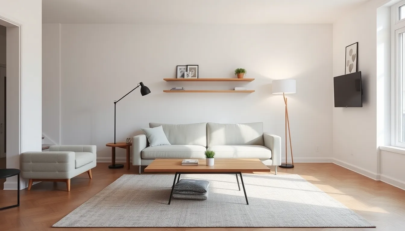

If you are furnishing a compact living room, avoid the trap of simply buying miniature pieces. Shrinking furniture often creates awkward gaps and hinders movement, making the space feel more cluttered. This guide focuses on spatial efficiency and visual perception, teaching you how to select items that maximize usable area while maintaining a sense of openness.
You will learn to balance scale and proportion, prioritize leggy designs, and optimize traffic flow. By understanding visual weight and integrating multi-functional pieces, you can create a layout that feels expansive and functional. This approach ensures your furniture supports the room’s architecture rather than competing with it, resulting in a living space that feels larger and more inviting.
Understanding Scale and Proportion in Compact Spaces
When you talk about small furniture, you’re often thinking of pieces that are physically tiny—like a miniature coffee table or a pint‑sized sofa. Those items can feel out of place because they don’t match the room’s proportions. The right approach is to choose furniture that is appropriately scaled: it fills the space in a way that feels intentional and balanced, without dominating or disappearing.
Oversized pieces drown a compact room, making every corner feel cramped. Imagine a massive sectional in a 12‑by‑12 foot area; the bulk of the sofa takes up the visual field, leaving little room for movement or other elements. Conversely, overly small pieces can appear lost, as if they were misplaced in the middle of a larger space. A tiny armchair tucked into a corner may be overlooked, and a miniature coffee table can feel like a decorative toy rather than functional furniture.
Visual weight explains this effect. Bulky, low‑slung items—like a deep, upholstered sofa—carry a heavy visual presence that can anchor a room and make it feel smaller. Tall, narrow pieces—such as a slim bookcase or a slim sofa with a light frame—have less visual mass and allow the eye to move more freely, creating a sense of openness.
Start by measuring the room’s floor area and the dimensions of each candidate piece. Add at least 18 inches of clearance around furniture to maintain smooth traffic flow. This simple spacing rule keeps the layout functional and prevents the space from feeling congested.
Prioritizing Leggy and Open-Frame Designs
The base of your furniture significantly influences the room’s perceived volume. When a sofa or coffee table rests directly on the floor, it creates a solid block that interrupts the visual continuity of the space. This boxy silhouette absorbs light and cuts off sightlines, making the area feel compressed and heavy. In contrast, leggy furniture lifts the main body off the ground, exposing the floor beneath. This exposed floor area acts as a visual anchor, allowing the eye to travel further into the room and creating an immediate illusion of depth.
To maximize this effect, look for pieces with slender, tapered legs or open-frame constructions. Mid-century modern styles often excel here, featuring clean lines and elevated profiles that avoid visual clutter. Metal or wire-frame chairs and tables are another excellent option, as their airy structure minimizes visual weight while maintaining necessary support. These designs let light pass through, preventing the accumulation of shadows that can make compact spaces feel dim and enclosed.
Avoid bulky, upholstered bases that touch the floor entirely. If you need storage, opt for low-profile units with visible legs rather than deep, boxy cabinets. The goal is to maintain a clear path for the eye from the entryway to the far wall. By selecting pieces that float above the surface, you reduce the overall mass in the room. This strategic choice ensures that even a densely furnished area retains a sense of airiness and flow, keeping the layout functional without sacrificing comfort or aesthetic appeal.
Strategic Layout for Maximum Traffic Flow
When you answer the question of How to Choose Furniture for a Small Living Room, the next step after floating pieces is to map the traffic flow. A clear pathway of about 18‑24 inches between sofas, chairs, and side tables lets people move without squeezing, preserving both comfort and the perception of space.
- Identify the primary entry point and draw an invisible line to the far wall; every major piece should stay at least a foot off that line.
- Position the main seating so that the route from the doorway to the light source remains unobstructed.
- Allow a minimum of 18 inches between any two items; widen the gap to 24 inches in high‑traffic zones such as near a coffee table.
If the room’s footprint is generous, consider pulling a sofa or armchair away from the wall by a foot or two. This creates a “floating” zone that defines a conversation area without crushing the surrounding space. The gap also reduces visual weight, keeping the room feeling light.
In a narrow layout, push the bulk of the furniture against the walls. This frees the centre for movement and prevents the room from feeling cramped. Keep low‑profile, leggy pieces close to the perimeter, and reserve the middle for a slim rug or a single accent chair.
Finally, never place a tall bookshelf, media console, or sofa in front of a window. Blocking natural light adds visual weight and shrinks the room’s perceived size. Positioning furniture to frame, rather than block, daylight enhances both illumination and the sense of openness.
Choosing Multi-Functional Pieces for Dual Purpose
Once your layout supports smooth traffic flow, address specific deficits with multi-functional pieces. These items consolidate storage and seating, reducing the total number of objects required in the room. Instead of filling every corner with dedicated units, select furniture that serves two distinct needs.
Consider a storage ottoman to replace a bulky coffee table while providing hidden space for blankets or magazines. A lift-top coffee table offers a stable surface for dining or working, eliminating the need for a separate dining set in tight quarters. If guests stay occasionally, a sofa bed provides overnight sleeping space without requiring a dedicated guest room. Each choice should directly solve a lack of seating or storage identified during your planning phase.
However, avoid accumulating too many multi-functional items. If every piece has a hidden mechanism, the space can feel cluttered and mechanical. These features only work if they are used consistently. A sofa bed that stays closed year-round adds unnecessary visual complexity. A storage ottoman that never gets opened becomes just another piece of furniture taking up floor space. Limit these items to two or three key pieces that you will actively use daily. This prevents the room from feeling like a storage unit rather than a living space. Focus on simplicity and ease of access to maintain a clean aesthetic while maximizing utility.
Color, Texture, and Material Selection
When light reflects off a wall, the hue it carries can either expand or contract the room’s perceived width. Lighter, neutral shades—ivory, soft greys, or pale taupe—mirror ambient illumination and give large surfaces a sense of openness, while keeping the eye from settling on a single point.
Contrast is achieved by placing darker or textured accents—such as a charcoal sofa or a woven rug—where you want the gaze to linger. These elements act as visual anchors without pulling the eye back toward the floor.
Materials that bounce light, like glass coffee tables, mirrored credenzas, or polished metal frames, amplify brightness without adding bulk. A single reflective surface can double the perceived square footage by redirecting daylight across the room.
Vertical patterns or tall bookcases guide the eye upward, stretching the eye line and creating a taller ceiling illusion. Stripes painted on a wall or a tall, narrow shelving unit can achieve this effect without cluttering the floor.
When selecting finishes, match the scale of the furniture to the room’s proportions; a glossy veneer on a low sofa keeps the visual weight light, whereas a matte, thick‑rimmed frame can ground a taller piece.
Layering textures—soft linen curtains, a chunky knit throw, a smooth lacquered sideboard—adds depth without visual clutter. Keep the dominant color palette muted; let the textures be the only source of contrast, so the space feels layered but not crowded.
Consider the finish of wood. Light‑stained oak or maple keeps the room bright, while a darker walnut or mahogany can be reserved for a single statement piece to avoid overpowering the space.
Finally, test samples under the room’s lighting before committing. A paint swatch on the wall or a fabric sample in the corner can reveal how the color behaves at different times of day, ensuring the chosen palette truly feels expansive.